Matthew Lindfield Seager
Moving a Micro.blog
Following Micro.blog’s pricing changes, rather than retiring an old blog hosted with a basic account, I decided to upgrade my main account to premium and migrate the old blog to the premium account. I get to access the advanced features of Micro.blog and the Micro.blog team doesn’t lose any recurring revenue, win-win!
Here’s the process I went through:
1. Logged into Micro.blog for Mac with the old account:
1. Export an archive of the blog - File → Export → Blog Archive
2. Renamed the archive from Micro.blog.bar to Micro.blog.zip and expanded it to check the contents… the only thing I could see that was missing was the Pages
3. Manually copied the text from our 2 custom Pages in Micro.Blog for Mac to a text file (ignored /archive and /photos)
4. Signed out of (“removed”) the old account from Micro.blog for Mac
2. Signed in to my old account on the web:
1. Deleted the blog
2. Changed the username on the old account (I don’t think this was necessary… later I changed it back)
3. Reset my Fediverse/Mastodon name
4. Downloaded a copy of my invoices
5. Canceled my old subscription
3. Logged in to my main account on the web:
1. Upgraded to premium
2. Added a new blog (same domain as the old one)
3. Added the two pages (only one visible in nav)
4. Deleted unwanted pages
4. Relaunched Micro.blog for Mac
1. Confirmed the new (old 😉) blog was available on the main account
2. Imported the posts and images File → Import → Blog Archive
The whole process took less than an hour (including writing this post). The slowest part was the blog import which took about 13 minutes to import 52 posts and 104 images (on a 280/20Mbps wifi connection… would have been 1/1Gbps if I’d plugged into Ethernet 🤦♂️).
My only other regret is that I didn’t think to make note of the “Design” section of the old blog… the new version looks very different and I can’t remember what theme I chose or customisations I made.
Overall, the whole process went shockingly smoothly and my only (very mild) complaint is that the Blog Archive format (or some suitable alternative) doesn’t include the pages or design info. Not being able to export and import pages might have been a bigger complaint from me if I’d had more than 2 pages to copy (or if I’d forgotten to make a manual copy before deleting the blog).
Once again I’m impressed with just how well designed and executed Micro.blog is despite being bootstrapped and being developed and supported by a very small team!
Microsoft have really upped their game in their efforts to repulse long-time Mac users. Apparently it isn’t enough to make their apps behave like visitors from another planet, now they are calling attention to their alienness in every way they can

Icon Set from a single image in 15 seconds
I built some AppleScript applets to launch Gmail to a specific account and Brave to a specific Profile (could also be done with Chrome) but I didn’t like the generic “Script” icon.

At first I just pasted my custom image into the “Get Info” window to update the icon but then when I made changes to the app and re-saved it, the icon got reset. I wanted to permanently updated the “applet.icns” file in the bundle but I didn’t want to spend an hour fiddling around with all the icon sizes.
Turns out, creating an icon set is super easy once you have your starting image:
- Copy your image
- Paste it onto the icon in the Get Info window
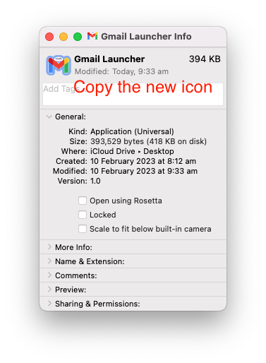
- Copy the new icon from the Get Info window
- “New from clipboard” in Preview (or just ⌘ N)
- Save…
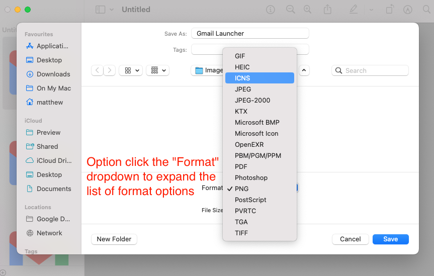
- Option click the Format dropdown and choose ICNS
- Save
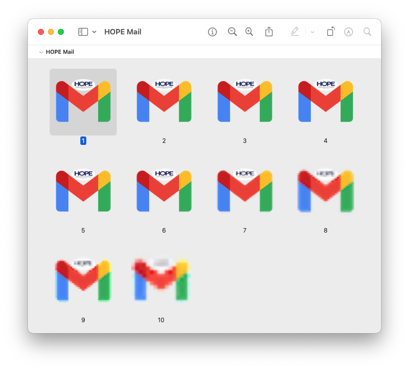
You now have an ICNS file with all 10 variations in it:

Step 2:

Step 3:

Step 6:

A Tale of Two Airlines
In February, we booked flights to Cambodia for July, on two different airlines with a few days stay in Singapore in between (this was before the whole world shut down due to COVID-19).
We are planning on moving there for two years to work in a small school and having to raise funds to support ourselves so we’re being very careful with our expenses. We booked with two budget airlines, offering cheap but generally non-transferrable and non-refundable flights. Scoot is the budget arm of Singapore Airlines while Jetstar is the budget arm of Qantas. I’ve already written in praise of Scoot and since then, Scoot has continued to exceed our expectations!!! Unfortunately we can’t say the same for Jetstar…
Scoot first contacted us in mid-March, long before our booked flight and as soon as it was clear the world was changing. They proactively offered us a free flight change (despite our fares being non-transferable). They also gave us a couple of months to decide whether to accept their offer which was VERY welcome in the midst of so much uncertainty.
In late May, Scoot contacted us again with an even more generous offer (plus multiple options to choose from). They let us choose between a 100% refund to our credit card (processed in the next 14 weeks) or a 120% refund in the form of travel vouchers (processed straight away). The travel vouchers were tempting but, given we needed to book new flights to Cambodia, we decided the refund made more sense.
In mid-June we received the full refund to our credit card, about 11 weeks earlier than promised. At this point our travel date was less than a month away and one airline had treated us wonderfully and refunded our flights whilst the other had not even made contact with us.
The next day we finally heard from Jetstar that our onward flight had been cancelled and that Jetstar was “offering all customers impacted by this announcement a Jetstar credit voucher to the full value of their untraveled booking”. Compared to Scoot, Jetstar was glacially slow, completely inflexible and totally unsympathetic.
Warning: Rant ahead
As it turns out, the Jetstar “Customer Guarantee” is worthless:
3. Our team are always here to help, 24 hours a day, 7 days a week
Nope! They’ve halved their hours and they offer no way of getting in touch other than chat. I had to wait almost 2 hours to chat to someone and then another 20 minutes to be connected to a supervisor. Overall the chat took more than 2 hours and 58 minutes.
4. We’ll let you know your choices if your flight is changed before you travel
Nope! They didn’t give us any choice and they waited months longer than a comparable airlines to let us know.
5. We’ll keep you updated and provide options if things don’t go to plan on the day
Nope! We received zero updates for three months (long after they stopped selling tickets for our flight so obviously they knew it wasn’t going to fly) and then they didn’t provide any options when our flight was cancelled.
6. You will get what you paid for
Ha!
7. You can have confidence in how quickly we will respond to an issue
Nope. Not only did they not resolve my issue (did I mentionbut when I asked to register a formal complaint the supervisor refused. I later discovered he should have given me a case number and/or referred me to their call centre.
8. You can have confidence in how quickly we will refund your money
Nope. They refused to refund our money.
Calculating taxable portions
Xero doesn’t support line items that have a mix of GST and non-GST items. To add a mixed invoice you have to add the taxable amount on one line and the non-taxable amount on another. Unfortunately many invoices simply provide the total amount paid and the GST included, which means doing the calculations (estimations) yourself.
Most of the time you can just multiply the GST paid by 10 to find out the taxable portion and use that to derive the exempt portion:
# converted to cents for simplicity
total = 9794
gst = 566
taxable = gst * 10 # => 5660
exempt = total - gst - taxable # => 3568
In this case I happen to know the “correct” amounts were actually $56.65 taxable and $35.63 exempt but we can’t know that for sure based on the inputs we were provided. Our calculated answers are within the range of valid solutions and everything adds up correctly.
However, this formula doesn’t handle some (legal) edge cases. On a $9 invoice with $0.82 GST we end up with a taxable portion of $8.20 and an exempt portion of -$0.02. It’s an easy mistake to make.
To correctly derive valid values for the taxable and exempt portions in this case we need to add a conditional:
total = 900
gst = 82
taxable = gst * 10 # 820
if taxable + gst > total
  taxable = total - gst # 818
end
exempt = total - gst - taxable
Netflix in the Classroom... kind of
Netflix in the Classroom… kind of
According to its terms of use, Netflix can’t be used in a classroom, it’s only for personal use. However, I recently learned there are certain Netflix documentaries that Netflix grants special permissions to allow educational streamings (e.g. Take Your Pills).
That sounds fantastic but it doesn’t seem like Netflix have actually thought about the intended audience for this as the user experience to identify these documentaries is awful.
If you’re a teacher, here are the steps to find out which documentaries are available:
- Navigate to a section of the PR site to see Netflix originals (as far as I know, only originals are eligible for these special permissions)
- Click on ‘All Alphabetical’ to get the full list
- We only want documentaries so click on the ‘Category’ heading to group the titles by category
- It defaults to sorting the categories reverse alphabetically so click on the ‘Category’ heading again to sort alphabetically (this moves the documentaries closer to the top and means we don’t have to click through 45 pages of films, series & stand-up comedy, just one or two pages of Anime)
- Scroll to the bottom, looking for documentaries. If there are none click ‘Next’
- Repeat step 5 until you’re past the ‘Anime Series’ category. Click/tap on the first documentary to open it up (note that the site seems to be using some sort of custom Javascript click detection so you can’t do normal web browser behaviour, like open the link in a new window. This will become a problem later)
- Check if the documentaty permits education screenings. If so, copy the URL (e.g. https://media.netflix.com/en/only-on-netflix/78922) somewhere for posterity… you’ll need it later to prove you’re allowed to screen the title
- Click/tap back in your browser to go to the listing page. Notice that when you go back the page number stays the same but the page reloads, losing your scroll position and sorting preferences
- Click the ‘Category’ heading to group by category, reverse-alphabetically (see also point 3 above)
- Click the ‘Category’ heading again to group by category, alphabetically (see also point 4 above)
- Find the next documentary (you’ll have to manually remember what you’re up to… they’re non-standard links so, unlike a standard web page, you don’t get any indication which links you’ve already clicked on) and click/tap on it to open it up
- Repeat steps 7-11 for the other 132 titles (and growing).
On a brand new laptop with no distractions and an uncontested 100Mbps Internet connection (three things I wouldn’t count on teachers in most schools having) I was able to check three documentaries in just under a minute, not including the time to save the URL if it was one of the small percentage that are permitted for educational use (nor the time to navigate to the next page when you finish one).
All up that’s going to be 40+ painful minutes of clicking and navigating for a list of about 25 education permitted documentaries (extrapolating from a fairly small sample).
A far better experience would be if the list view contained a little icon of some sort (a mortaboard hat icon perhaps) indicating which documentaries permit education screenings.
Standard HTML links (that allow opening links in a new tab and seeing which links have already been visited) would also be a huge improvement.
I contacted Netflix PR (the part of the organisation that hosts the “Only on Netflix” portion of the site) over a week ago and asked them for more information about the titles available under this service and whether they were aware of the usability and accessibility issues but I didn’t receive even an automated reply. I will update this post if they get back to me.